Goals:
- Create a pie chart and and bar chart based on your own data.
- Calculate mean and median by using the Excel functions (commands) AVERAGE and MEDIAN.
Instructions
I) This homework is based on Lesson 3. So watch the video BEFORE you do this set of homework.
II) Create ONE single worksheet with the following items:
(Notice: the requirement is one worksheet. Before you upload your assignment to Canvas, make sure you delete any extra worksheets from your .xlsx file. )
- a categorical variable
- Come up with your own categorical variable with at least four values (i.e. four groups/categories)
-
-
-
- DO NOT copy my example. You will NOT get any credit for this question if your example sounds too similar to mine (e.g. hair color, backpack color, pen color, etc.).
-
-
-
-
-
- Your variable have to be entirely different than mine! If you are not sure, check with me BEFORE you submit your assignment.
-
-
-
- A column of Counts for the variable
-
- Do NOT use percentages for the Counts column — just count the frequency of each group/category.
-
- Make sure you name your variable specific enough so that the readers know what you are measuring. For example, “health” is NOT specific enough as a categorical variable.
- a pie chart:
- A chart title which should be clear enough to tell the readers what you are measuring e.g. a title such as “Students” is NOT clear enough.
-
- Choose a design which shows the percentages of the groups/categories in your chart
- a bar graph:
- A chart title which should be clear enough to tell the readers what you are measuring e.g. a title such as “Students” is NOT clear enough.
-
- Labels for the x and y axis.
-
- Choose a design such that the bars are separated with space!
- a quantitative variable with eight data values and calculate their mean and median:
-
- Come up with your own quantitative variable with eight data values such that the mean is greater than the median (Notice that this is different than what is shown in the video!)
-
-
- DO NOT copy my example. You will NOT get any credit for this question if your example sounds too similar to mine (e.g. test scores, exam scores, etc.).
-
-
-
- Your variable has to be entirely different than mine! If you are not sure, check with me BEFORE you submit your assignment.
-
-
- You can choose whatever data values you want as long as they make sense.
-
- Make sure you name your variable specific enough so that the readers know what you are measuring. For example, “Students” is NOT specific enough as a quantitative variable.
- Name of the worksheet
Replace the default worksheet name Sheet1 with some other name that makes sense to you.
(See Section IV below for the layout of what your worksheet should look like.)
III) Name your file extension
Make sure you save your Excel file with the extension .xlsx.
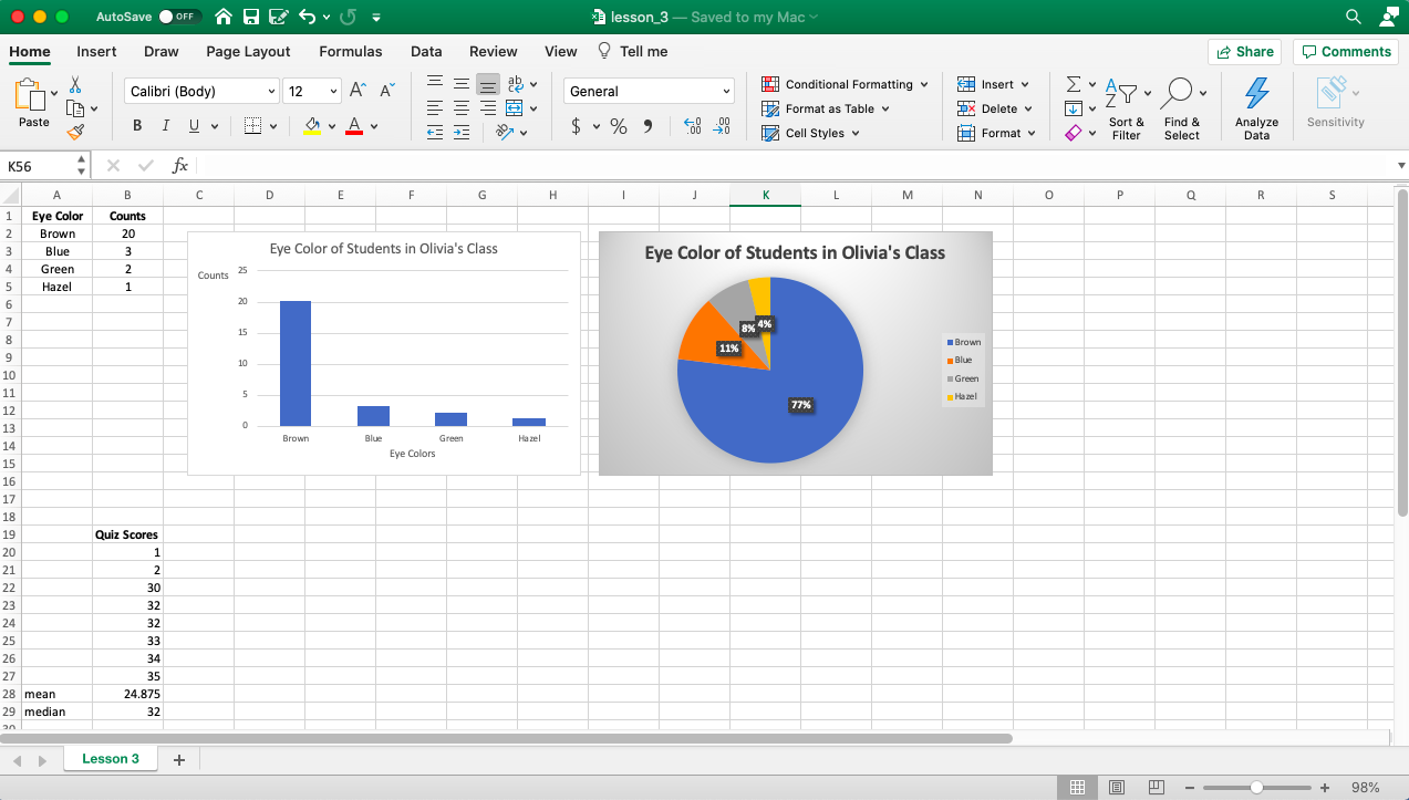
IV) Here is what the layout of your worksheet should look like:
You can choose a different design or colors as long as you have all the items mentioned above.
Come up with your own variable and data—don’t copy from the screenshot below.
-END-