Goals:
- Create a scatterplot with a linear regression equation based on your own data.
- Calculate correlation and r-squared by using the Excel function (command) CORREL and the symbol ^2 .
Instructions
I) This homework is based on Lesson 4.
II) Create ONE single worksheet with the following items:
(Notice: the requirement is one worksheet. Before you upload your assignment to Canvas, make sure you delete any extra worksheets from your .xlsx file. )
- Two quantitative variables
- Come up with two quantitative variables that are negatively associated.
-
-
- DO NOT copy my example. You will NOT get any credit for this question if your example sounds too similar to mine (e.g. my weekly advertising expense, daily marketing expense, my daily spending budget, etc.).
-
-
-
- Your variables have to be entirely different than mine! If you are not sure, check with me BEFORE you submit your assignment.
-
-
- The explanatory variable should be the “left” column!!!
-
- 8 pairs of (x,y) observations. That is, you make up your own data. Make sure your variables and data make sense.
-
- The correlation between the two variables should be a negative number but not exactly equal to 1. That is, \( r \neq -1 \).
- The correlation between the two variables should be a negative number but not exactly equal to 1. That is, \( r \neq -1 \).
-
- Make sure you name your variables specific enough so that the readers know what you are measuring. For example, “Students” or “Weather” are NOT specific enough as quantitative variables
- Correlation:
- Calculate correlation of the 8 pairs of observations by using the command CORREL .
- R-squared:
- Calculate r-squared of the 8 pairs of observations by using the symbol ^2 .
- Scatterplot with the following:
- a chart title
- a title for the x axis (including the unit of measurement)
- a title for the y axis (including the unit of measurement)
- a linear regression equation
- R-squared
- Name of the worksheet
Replace the default worksheet name Sheet1 with some other name that makes sense to you.
(See Section IV below for the layout of what your worksheet should look like.)
III) Name your file extension
Make sure you save your Excel file with the extension .xlsx.
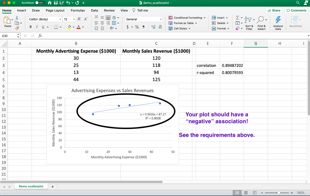
IV) The layout of your worksheet should be similar to the diagram shown in the video demonstration EXCEPT that you need to come up with a negative association:
- Your diagram should have a negative association
- You can choose a different design or colors as long as you have all the items mentioned above.
- Come up with your own variables and data—don’t copy from the screenshot below.
-END-