Table of Contents
- Excel #5 — Boxplots & Quartiles
- Lesson 5 — Boxplots & Quartiles
- Lesson 4 — Scatterplot with Trendline
- Excel #4 — Scatterplot with Trendline
- Lesson 3 — Pie and Bar Charts
- Excel #3 — Pie Charts & Bar Charts
- Lesson 2 — Sample Standard Deviation
- Excel #2 — Sample Standard Deviation
- Excel #1 — My Top 10 Moves
- Lesson 1 — The Basics
-
Excel #5 — Boxplots & Quartiles
Goals:
- Create a boxplot with an outlier based on your own data by creating a Box and Whisker plot in Excel
- Calculate Q1, Q2 (median) and Q3 by using the Excel function (command) QUANTILE.EXC
- Calculate upper and lower fence by using arithmatic functions in Excel such as +, – and *, etc.
Instructions
I) This homework is based on Lesson 5.
II) Create ONE single worksheet with the following items:
(Notice: the requirement is one worksheet. Before you upload your assignment to Canvas, make sure you delete any extra worksheets from your .xlsx file. )
- One quantitative variable
- Come up with one quantitative variable.
-
-
- DO NOT copy my example. You will NOT get any credit for this question if your example sounds too similar to mine (e.g. weights of dogs, weights of monkeys, weights of apples, etc.).
-
-
-
- Your variable has to be entirely different than mine! If you are not sure, check with me BEFORE you submit your assignment.
-
-
- 15 observations (data points). That is, you make up your own data. Make sure your variable and data make sense.
-
- Make sure you name your variables specific enough so that the readers know what you are measuring. For example, “Students” or “Weather” are NOT specific enough as quantitative variables
- Box and Whisker plot in Excel with the following:
- an upper or lower outlier
- a chart title
- a title for the y axis (including the unit of measurement)
- Calculations of the following by using QUANTILE.EXE and other arithmetic functions (see video for details):
- Q1
- Q2 (median)
- — you MUST use QUANTILE.EXC , not MEDIAN because we are learning the QUANTILE.EXC function in this assignment
- Q3
- IQR
- 1.5 * IQR
- Lower fence
- Upper fence
- Name of the worksheet
Replace the default worksheet name Sheet1 with some other name that makes sense to you.
(See Section IV below for the layout of what your worksheet should look like.)
III) Name your file extension
Make sure you save your Excel file with the extension .xlsx.
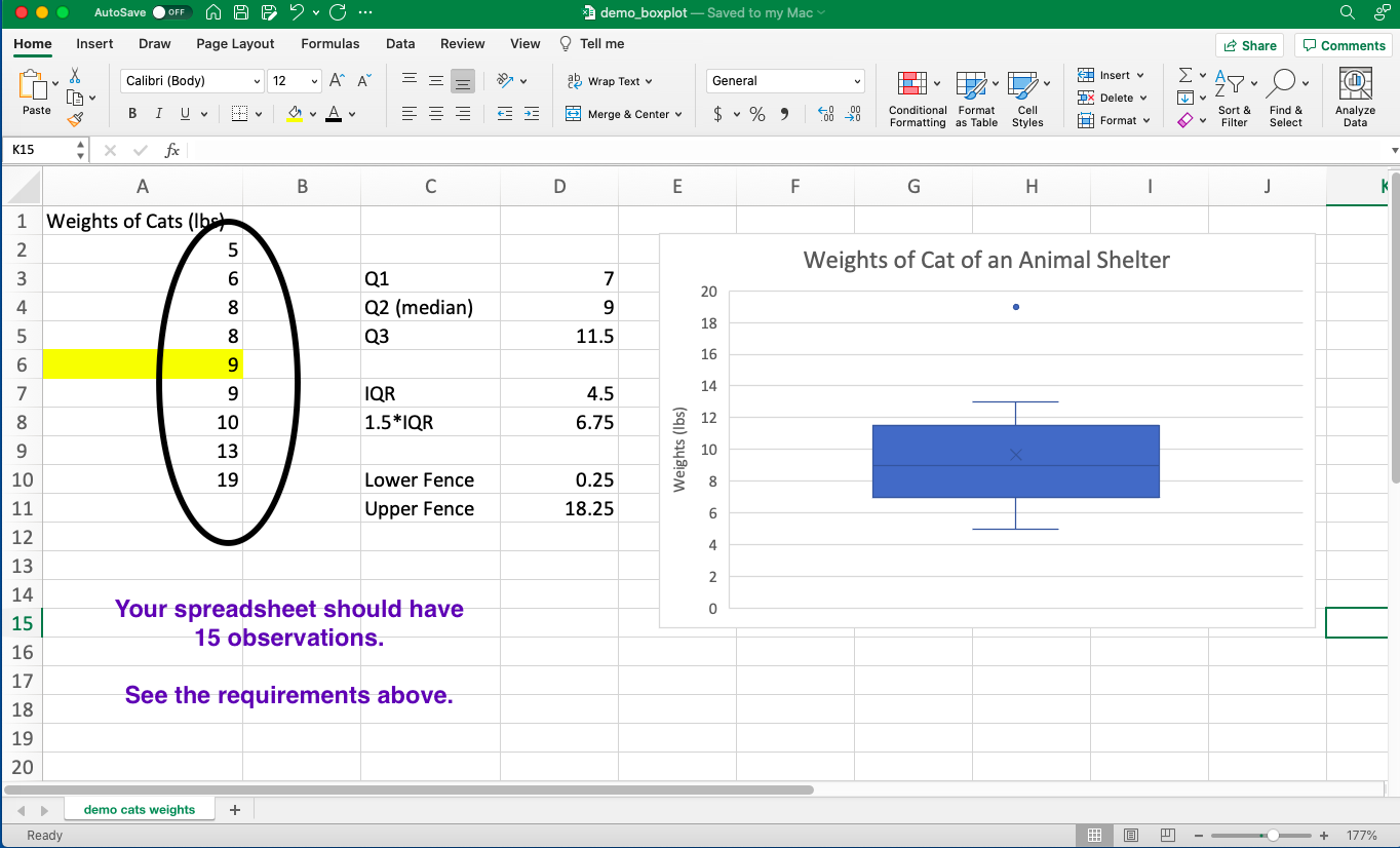
IV) The layout of your worksheet should be similar to the diagram shown in the video demonstration EXCEPT that you need to come up with 15 observations:
- Your diagram should have 15 observations
- You can choose a different design or colors as long as you have all the items mentioned above.
- Come up with your own variable and data—don’t copy from the screenshot below. Do NOT use the variable “weight” in your spreadsheet.
-END-
-
Lesson 5 — Boxplots & Quartiles
Learning Objectives
- Create a boxplot by creating a Box and Whisker plot in Excel
- Calculate Q1, Q2 (median) and Q3 by using the Excel function (command) QUANTILE.EXC
- Calculate upper and lower fence by using arithmetic functions in Excel such as +, – and *, etc.
Instruction
Watch the following video and then do assignment Excel #5:
-END-
-
Lesson 4 — Scatterplot with Trendline
Learning Objectives
- Create a scatterplot with a linear regression equation.
- Calculate correlation and r-squared by using the Excel function (command) CORREL and the symbol ^2 .
Instruction
Watch the following video and then do assignment Excel #4:
-END-
-
Excel #4 — Scatterplot with Trendline
Goals:
- Create a scatterplot with a linear regression equation based on your own data.
- Calculate correlation and r-squared by using the Excel function (command) CORREL and the symbol ^2 .
Instructions
I) This homework is based on Lesson 4.
II) Create ONE single worksheet with the following items:
(Notice: the requirement is one worksheet. Before you upload your assignment to Canvas, make sure you delete any extra worksheets from your .xlsx file. )
- Two quantitative variables
- Come up with two quantitative variables that are negatively associated.
-
-
- DO NOT copy my example. You will NOT get any credit for this question if your example sounds too similar to mine (e.g. my weekly advertising expense, daily marketing expense, my daily spending budget, etc.).
-
-
-
- Your variables have to be entirely different than mine! If you are not sure, check with me BEFORE you submit your assignment.
-
-
- The explanatory variable should be the “left” column!!!
-
- 8 pairs of (x,y) observations. That is, you make up your own data. Make sure your variables and data make sense.
-
- The correlation between the two variables should be a negative number but not exactly equal to 1. That is, \( r \neq -1 \).
- The correlation between the two variables should be a negative number but not exactly equal to 1. That is, \( r \neq -1 \).
-
- Make sure you name your variables specific enough so that the readers know what you are measuring. For example, “Students” or “Weather” are NOT specific enough as quantitative variables
- Correlation:
- Calculate correlation of the 8 pairs of observations by using the command CORREL .
- R-squared:
- Calculate r-squared of the 8 pairs of observations by using the symbol ^2 .
- Scatterplot with the following:
- a chart title
- a title for the x axis (including the unit of measurement)
- a title for the y axis (including the unit of measurement)
- a linear regression equation
- R-squared
- Name of the worksheet
Replace the default worksheet name Sheet1 with some other name that makes sense to you.
(See Section IV below for the layout of what your worksheet should look like.)
III) Name your file extension
Make sure you save your Excel file with the extension .xlsx.
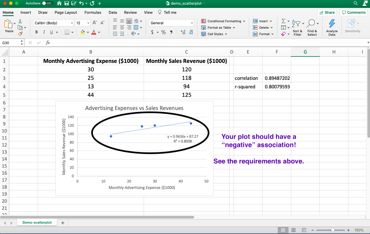
IV) The layout of your worksheet should be similar to the diagram shown in the video demonstration EXCEPT that you need to come up with a negative association:
- Your diagram should have a negative association
- You can choose a different design or colors as long as you have all the items mentioned above.
- Come up with your own variables and data—don’t copy from the screenshot below.
-END-
-
Lesson 3 — Pie and Bar Charts
“A picture is worth a thousand words!”
Learning Objectives
- Create a pie chart and bar chart
- Calculate mean and median by using the Excel functions AVERAGE and MEDIAN.
(Excel functions are also called Excel commands.)
Instruction
Watch the following video and then do assignment Excel #3:
-END-
-
Excel #3 — Pie Charts & Bar Charts
Goals:
- Create a pie chart and and bar chart based on your own data.
- Calculate mean and median by using the Excel functions (commands) AVERAGE and MEDIAN.
Instructions
I) This homework is based on Lesson 3. So watch the video BEFORE you do this set of homework.
II) Create ONE single worksheet with the following items:
(Notice: the requirement is one worksheet. Before you upload your assignment to Canvas, make sure you delete any extra worksheets from your .xlsx file. )
- a categorical variable
- Come up with your own categorical variable with at least four values (i.e. four groups/categories)
-
-
-
- DO NOT copy my example. You will NOT get any credit for this question if your example sounds too similar to mine (e.g. hair color, backpack color, pen color, etc.).
-
-
-
-
-
- Your variable have to be entirely different than mine! If you are not sure, check with me BEFORE you submit your assignment.
-
-
-
- A column of Counts for the variable
-
- Do NOT use percentages for the Counts column — just count the frequency of each group/category.
-
- Make sure you name your variable specific enough so that the readers know what you are measuring. For example, “health” is NOT specific enough as a categorical variable.
- a pie chart:
- A chart title which should be clear enough to tell the readers what you are measuring e.g. a title such as “Students” is NOT clear enough.
-
- Choose a design which shows the percentages of the groups/categories in your chart
- a bar graph:
- A chart title which should be clear enough to tell the readers what you are measuring e.g. a title such as “Students” is NOT clear enough.
-
- Labels for the x and y axis.
-
- Choose a design such that the bars are separated with space!
- a quantitative variable with eight data values and calculate their mean and median:
-
- Come up with your own quantitative variable with eight data values such that the mean is greater than the median (Notice that this is different than what is shown in the video!)
-
-
- DO NOT copy my example. You will NOT get any credit for this question if your example sounds too similar to mine (e.g. test scores, exam scores, etc.).
-
-
-
- Your variable has to be entirely different than mine! If you are not sure, check with me BEFORE you submit your assignment.
-
-
- You can choose whatever data values you want as long as they make sense.
-
- Make sure you name your variable specific enough so that the readers know what you are measuring. For example, “Students” is NOT specific enough as a quantitative variable.
- Name of the worksheet
Replace the default worksheet name Sheet1 with some other name that makes sense to you.
(See Section IV below for the layout of what your worksheet should look like.)
III) Name your file extension
Make sure you save your Excel file with the extension .xlsx.
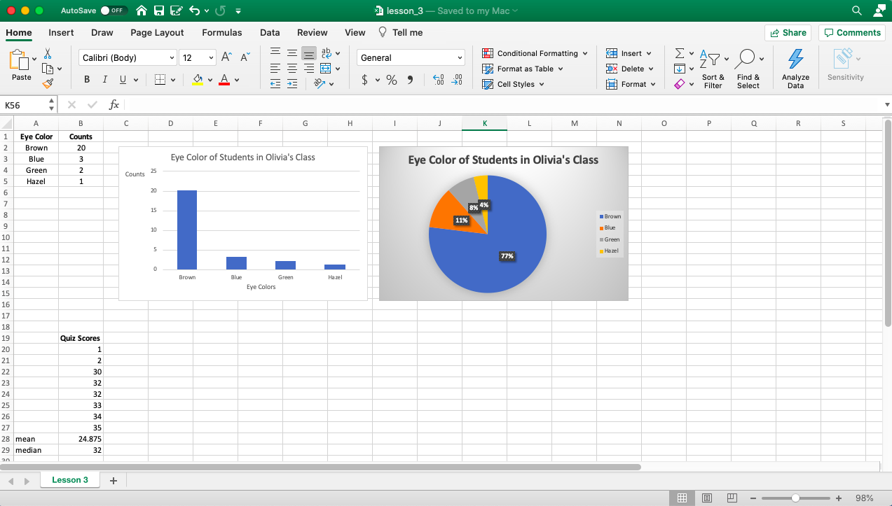
IV) Here is what the layout of your worksheet should look like:
You can choose a different design or colors as long as you have all the items mentioned above.
Come up with your own variable and data—don’t copy from the screenshot below.
-END-
-
Lesson 2 — Sample Standard Deviation
Standard deviation is a very important concept in statistics.
Why? There are always variations regarding heights, weights, eye colors or some other characteristics among individuals. No two individuals are exactly the same — even identical twins are not 100% the same in their genes.
(Recall that the term “individuals” include people, cats, dogs or anything whose characteristics a researcher is interested in exploring.)
Learning Objectives
- Calculate sample standard deviation by the Excel function STDEV.S
- Rename a worksheet
Instruction
Watch the following video and then do assignment Excel #2:
-END-
-
Excel #2 — Sample Standard Deviation
The goal of this assignment is to help you acquire a sense of how “spread out“ a small set of observations is.
For example, when we say the standard deviation is 2 inches, how spread out do we expect our data values are around the center and from each other?
Of course, we can always easily calculate the standard deviation by using our calculator or Excel. But it is important to get an intuitive feel for the size of a standard deviation.
Instructions
I) This homework is based on Lesson 2. So watch the video before you attempt this homework.
II) You need to come up with your own data in this homework —DO NOT COPY my data shown in the video or in the screenshot below. Otherwise, your submission will NOT receive any credit.
III) Create a worksheet with the following calculations:
(See Section V below for what your spreadsheet should look like.)
Question 1)
-
- Come up with four different numbers between 1 and 20 such that
-
- their sample standard deviation is between 1 and 2
-
- Come up with four different numbers between 1 and 20 such that
(You can choose the numbers 1 and 20 but you don’t have to.)
Question 2)
-
- Come up with four numbers between 1 and 20 such that
-
- two of the numbers are the same (e.g. 1,1 or 2,2, etc.)
- the sample standard deviation of the four numbers is between 3 and 5
-
- Come up with four numbers between 1 and 20 such that
(You can choose the numbers 1 and 20 but you don’t have to.)
Question 3)
-
- Come up with four numbers between 1 and 20 such that
-
- two of the numbers are the same (e.g. 1,1 or 2,2, etc.)
- the sample standard deviation of the four numbers is between 6 and 8
-
- Come up with four numbers between 1 and 20 such that
(You can choose the numbers 1 and 20 but you don’t have to.)
IV) Name your worksheet
Replace the default worksheet name Sheet1 with some other name that makes sense to you. I use E2 as shown in the image in section V below but you don’t have to follow that. (Points will be deducted if you don’t replace the default worksheet name.)
V) Name your file extension
Make sure you save your file with the extension .xlsx.
Note that there should only be one single .xlsx in your file name.
Points will be deducted if your file has more than one .xlsx.
For example, points will be deducted for the following file names:
Excel2.xlsx.xlsx
olivia_mah.xlsx.xlsx.xlsx
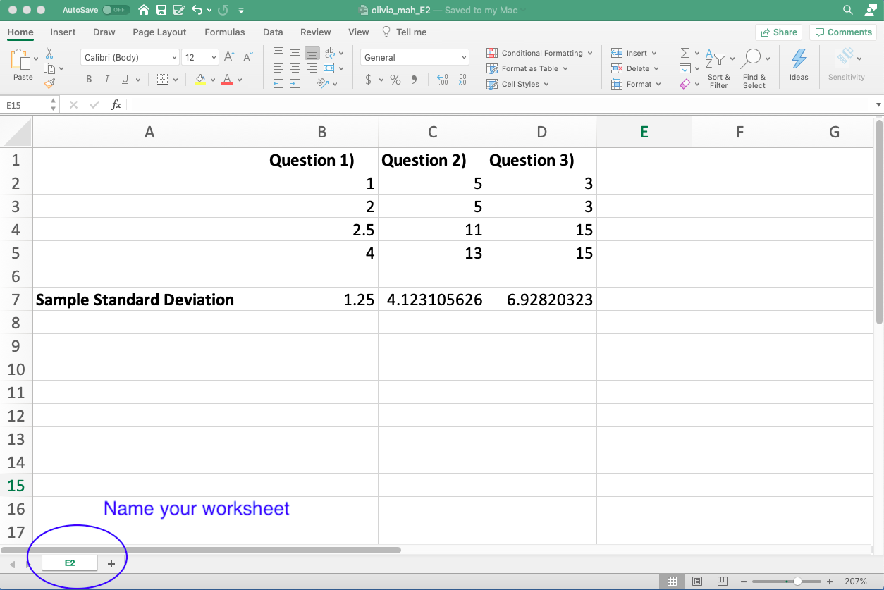
V) Here is what your worksheet should look like:
You need to come up with your own data for this homework — DO NOT COPY my data shown in the video or in the screenshot below. Otherwise, your submission will NOT receive any credit.
-END-
-
-
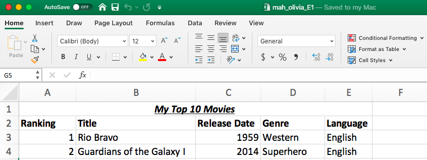
Excel #1 — My Top 10 Moves
Instructions
I) This assignment is based on Lesson 1.
II) Create a spreadsheet similar to the one in Lesson 1:
— Instead of the Movie Inventory, the title of the spreadsheet is:
My Top 10 Movies
That is, you enter information about your top 10 favorite movies.
— Create the following columns in your spreadsheet:
-
- Ranking
- Title
- Release Date
- Genre
- Language
— Create 10 rows of data for the above columns
— Follow the video’s formatting of the column headings (bold-typed) and the overall heading (centered, italicized and merged center)
— Here is the layout that you should have:
III) Correct file extension
When you are ready to submit your spreadsheet to Canvas, make sure that the extension of the file is .xlsx.
If the file extension is not shown on your screen when you are saving the document, then it could be because your desktop is not set to show file extensions. To show file extension on your computer, do the following:For PC:
https://www.howtogeek.com/205086/beginner-how-to-make-windows-show-file-extensions/
For Mac:
https://support.apple.com/guide/mac-help/show-or-hide-filename-extensions-on-mac-mchlp2304/mac
IV) Grading Scheme
Computer work is ALL about details, details and details!
The grader will check if your spreadsheet follows the instructions listed above. Points will be deducted for each mistake. Common mistakes include but are not limited to: missing a column, missing a row, not bold-typing or merging the title, etc.
-END-
-
-
Lesson 1 — The Basics
Learning Objectives
- Be familiar with the terms in Excel
- Know how to enter data into a spreadsheet
Instructions
1. In this lesson, you will watch a video demonstrating the basic techniques in Excel. Before watching, notice the following:
— The version in the video is Excel 2016 on a PC. If you are other recent versions of Excel such as 2019 or 2020, your screen layout should still be very similar to that in the video. Scroll down the page for details.
— The Excel layout on a Mac is very similar to that of a PC.
— The video also talks about tricks and shortcuts but don’t worry if you don’t get them. The most important thing is to be able to enter data and do simple formatting at this stage.
—Here is the video:
Beginner’s Guide to Microsoft Excel
(Since I don’t have a PC, I am using the above video so that PC users can see the layout on their screen. From next lesson onward, I will use my Mac for demonstration. Regardless, the Excel on PC and Mac are very similar since we are using the very basic features only.)
2. For Mac users:
The PDF below shows:
—where to find the Excel templates
— where to find the Merge & Center option
— where to find the Save As option-END-